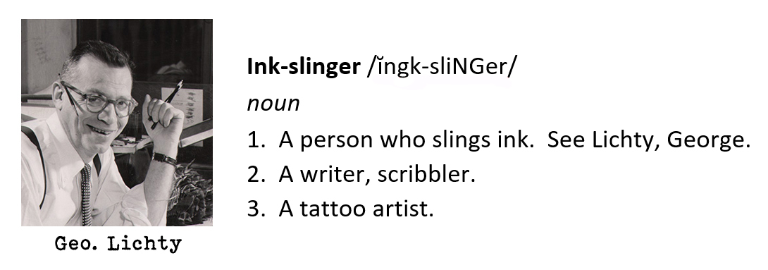
George Lichty: The Slingiest Ink-Slinger of ‘em All!
In the world of comic art, artists are often dubbed ink-slingers based upon not only the volume of ink used, but the activity in which that ink is slung. Percy L. Crosby, the creator of Skippy, was an ink slinger of high order. Jerry Robinson, who wrote the first biography of Crosby, stated that the artist “…captured lightning in a bottle”, referring to Crosby’s active and juicy pen lines, which described both forms and movement at the same time. George Herriman, of Krazy Kat fame, moved through a variety of approaches with pen and ink throughout his career, but his early Krazy Kat Sunday pages, from 1916 through the 1920s, could be master classes in ink-slinging. Herriman wielded an active pen line, one that could load up areas of hatching and cross-hatching, along with sparser lines that contained a marvelous energy. You had folks like Milt Gross, whose wonderfully expressive ink-slinging looked like it was just tossed off with no preliminary sketching, and Charles Voight, who seemed to straddle the line between looseness and formality, but with ink-slinging juiciness. You also had the more controlled comic strip ink-slingers, like James Montgomery Flagg and Frank Godwin, both out of the Charles Dana Gibson School of Ink-Slinging.
And then there is George Maurice Lichtenstein, better known to his legion of fans as George Lichty. Before I delve into the fantabulous Mr. Lichty, let’s check out some excerpts by Stephen Becker, from his seminal 1959 book, Comic Art in America:
“One of the daily panelists brings us back to that region of partial insanity from which the best fantasy arises. His name is Lichty (George Maurice Lichenstein); and his quality is total irreverence… Lichty respects laughter and little else… Regularly he makes mincemeat of the American politician; his senators and congressmen are the most blatantly bombastic and hypocritical of the species. He has carried Soviet logic to a lunatic extreme in his satires of commissars and bureaucrats. He spoofs birthday parties, patriotic holidays, club-women, Sunday drivers, doctors, lawyers and Indian chiefs, and he does all this with a diabolical gusto instantly communicated to the reader.”
Becker also commented on Lichty’s art and process:
“Lichty works fast. His style is apparently slapdash; he pencils in outlines and features, and then brushes on tones or color. (He once said that he could finish a week’s work in two days.) But the antic drawing—the fiendish expressions, the fierce glares of disapproval, the bland arrogance of the governmental face—is the perfect medium for his antic humor.”
Becker had the benefit of writing about Lichty and his work during what I consider Lichty’s heyday; the 1950s. While I adore Lichty’s work during all periods, things seemed to coalesce for him artistically from the mid-to-late 1940s and into the 50s. To witness that comic strip genius on a daily basis must have been truly wonderful.
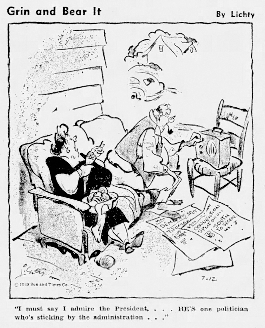
One other such witness to Lichty’s genius was a fellow who occupied the White House from 1945 to 1953: Harry Truman. Truman was a big fan of Lichty’s work, apparently owning one hundred Lichty originals, many of which hung in his home. Truman wrote to Lichty, commenting on his Senator Snort character in one letter. “I’ve enjoyed your Senator Snort cartoons very much,” Truman wrote, “and hope you’ll keep them up.” President Truman also requested a specific original cartoon from Lichty. The panel appeared in print on July 12, 1948 and pictures a husband and wife sitting outside, while the husband fiddles with the portable radio. The woman says, “I must say I admire the President…He’s one politician who’s sticking by the administration…”
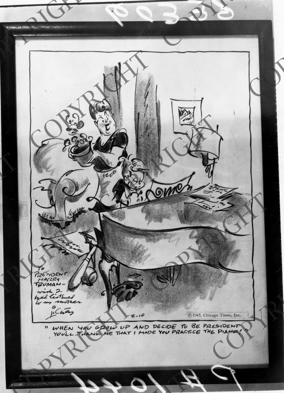
Here’s another piece, swiped from the Truman Presidential Library, autographed to the president by Lichty. The caption is: “When you grown up and decide to be President you’ll thank me that I made you practice the piano!”. The original cartoon is inscribed: “To President Harry Truman – Wish I had listened to my mother. Lichty.”
Before delving into Lichty’s artwork, let’s take a brief look at his biography, cobbled together from various sources, online, in newspaper archives, and from books.
George Maurice Lichtenstein was born in Chicago’s Near North Side to Julius and Ella Hirsh Lichtenstein on May 16, 1905. Julius Lichtenstein was a house painter who eventually because a Chicago city painting foreman. Lichty attended Lane Tech High School, for which he was the chief cartoonist on the school paper. At the same time, at age 16, Lichty became a professionally published cartoonist by selling his first cartoon to Judge magazine. Attending the Art Institute of Chicago in 1924 and 1925, Lichty was apparently kicked out when he was discovered writing a gag-line underneath a painting by El Greco. I’ve read various accounts of this story from a number of sources, so there much be some kernel of truth in it. Lichty landed on his academic feet soon thereafter, attending the University of Michigan, where he became the editor of the university’s humor magazine, the Gargoyle. In 1928, College Humor magazine named Lichty the top college cartoonist of the year, and awarded him a sleek yellow Essex sports roadster. Lichty’s win was a hollow one, as the university instituted a driving ban that year, so Lichty left the car in Ypsilanti, eventually giving it to his father, who traded it in for a sedan. As a side note, the third-place winner in the College Humor contest was some hack cartoonist named Milton Caniff!
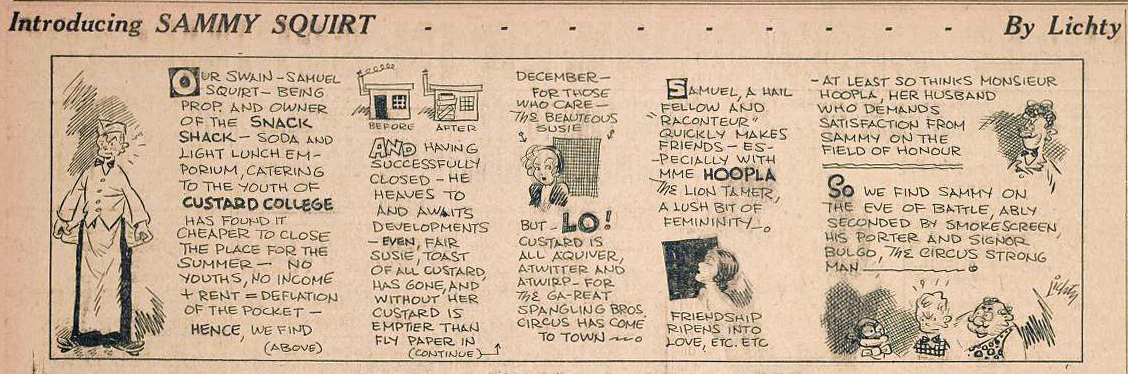
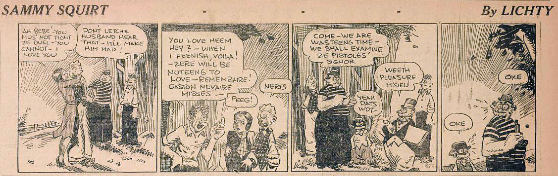
Lichty graduated from the University of Michigan in 1929, the first year of the Great Depression, and took a thirty-five dollar a week job retouching photos for the Chicago Times. Lichty eventually found himself drawing cartoons for a seemingly endless series of puzzle contests, but that series ended when the publisher, Samuel E. Thomason, called Lichty into his office in 1931, telling him, “I’ve decided that you’re ripe to do a daily comic strip…It’s going to combine the best features of Moon Mullins, Gasoline Alley, Smitty, Little Orphan Annie, and a host of others.” No pressure. The daily strip, Sammy Squirt, was about a soda jerk (squirt, get it?) and his adventures. The strip did not live up to Thomason’s lofty expectations. In Lichty’s own words, from a 1949 article, “Sammy ran for about a year…To be honest about it, ‘ran’ is a more active word than his career justified. He really walked—and I was always behind in meeting his deadlines. The editor finally decided to give up on him, and I drew a very touching sunset in the final strip.” Lichty later referring to the demise of Sammy Squirt as dying in “a blaze of obscurity.” The strip was actually pretty good for a first effort, though it looked more like many of the bigfoot strips of the day, than what we would later recognize as Lichty’s mature style.
While Sammy Squirt was not the hit Mr. Thomason had hoped for, Lichty was to strike gold a short time later with his daily panel feature, Grin and Bear It. Lichty’s sharp barbs and commentary in his Gargoyle cartoons were to pay dividends in his new panel, as he delivered commentary on all the things Stephen Becker mentioned at the top of this piece. The officially listed starting date for Grin and Bear It is March 1932, though the earliest examples I’ve been able to find are from 1934. I did run across an Edgar Kennedy comedy short with the same title from 1933, though it’s hard to know if the short was influenced by Lichty’s work, or vice-versa.
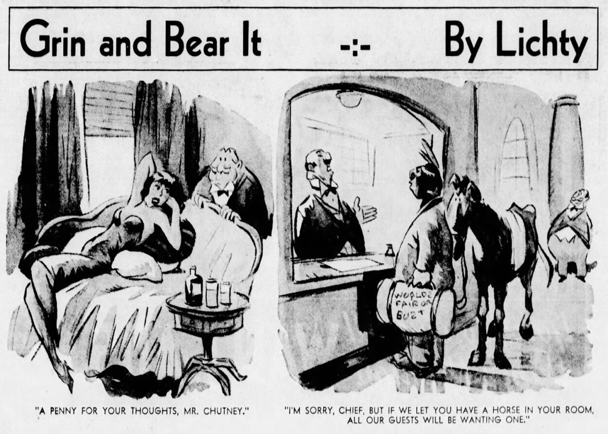
Grin and Bear It had a long run, from 1932 to 2015, with Rick Yager and Fred Wagner taking over from Lichty in the later years. Lichty was long-admired by his colleagues, and was a four-time winner of the National Cartoonists Society’s Newspaper Panel Cartoon Award. Lichty received this award for Grin and Bear It in 1956, 1960, 1962 and 1964.
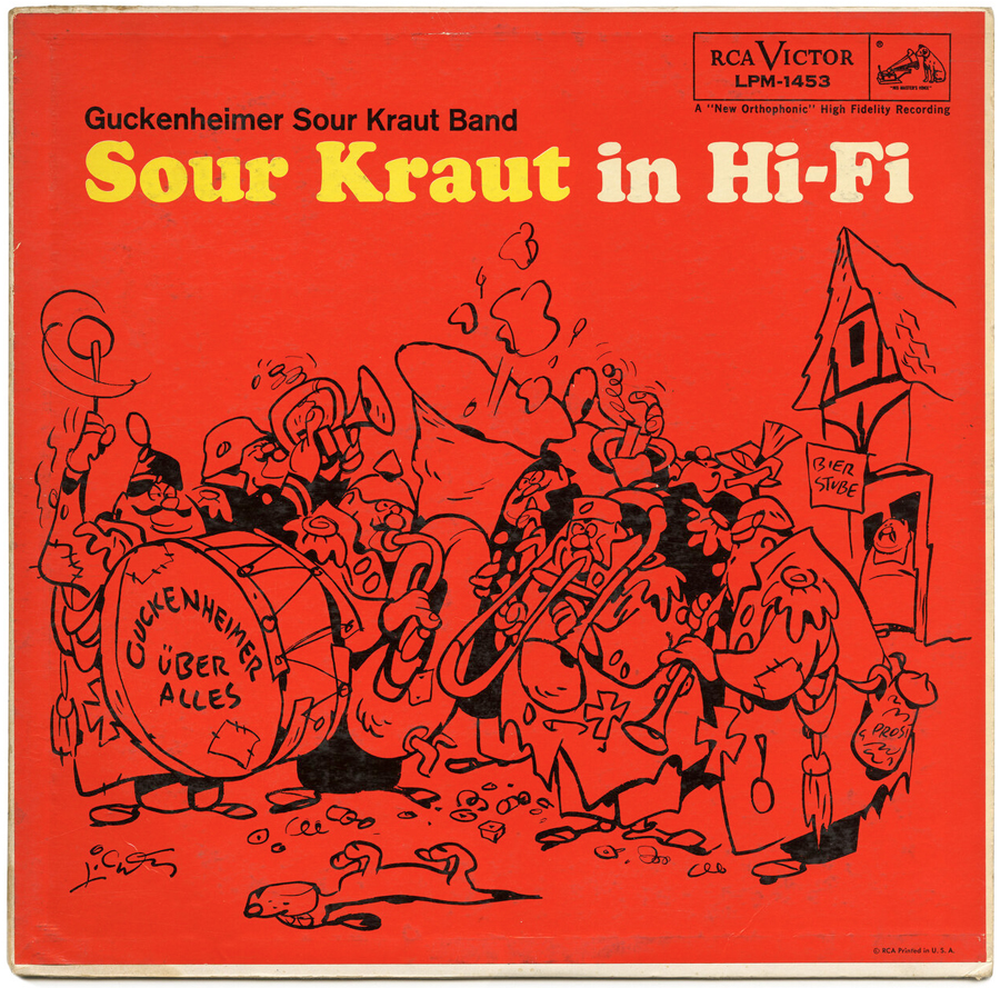
In addition to Grin and Bear It, Lichty performed as a percussionist with the Guckenheimer Sour Kraut Band. After his retirement from the panel cartoon, Lichty took up oil painting, sometimes incorporating his cartoon approach in the paintings. Lichty died from a heart attack on July 18, 1983. He was 78 years old.
“I just love Lichty so much. Look at how cornball he started and where he ended up. They are the funniest drawings I’ve ever seen in my life. His work is pure old school cartooning.” – Ralph Bakshi
Ralph and I have talked about favorite cartoonists and artists for years. Philip Guston, George Herriman and George Lichty have risen to the top of our conversations most recently. Guston’s work can look awkward, purposely clumsy, and ham-fisted, but it is always honest, especially the paintings from his last 20 years. Herriman, Ralph and I both agree, was a maestro. You can go back to early printed conversations with Ralph and he’ll talk about the utter joy of Herriman’s work. Bob (R.C.) Harvey may have summed Herriman up best, when he talked about him being the best marriage of the visual and the verbal. And then there’s Lichty. Ralph has crowned him as one of the best cartoonists of all-time, and I cannot disagree.
I interviewed Bud Blake at his home in Maine back in 2004. When we talked about some of Bud’s favorite cartoonists, he referred to them as “dirty cartoonists”. Not because of any risqué content, but because of how they approached cartooning. Bud was talking about Jimmy Hatlo and Billy DeBeck specifically, when he said, “…well think about DeBeck. It’s the same thing. He’s not going to draw just any character. It’s going to be funny, with a big nose and pot belly. He just can’t leave it alone. He’s a pure cartoonist…” The same thing can be said about George Lichty’s work.
I opened up the Lichty conversation on my Facebook page, and received some interesting and insightful commentary about him. Mark Newgarden, the cartoonist, illustrator, author, teacher, Brooklyn bon vivant, and winner of the Silver Sluggo Award put it succinctly: “It’s a magic trick. It shouldn’t work but it does.” Comics expert and historian George Topham Hayes added his own observations about Lichty’s work, saying: “There’s an I-don’t-give-a-fucķ bravura quality to the drawing and the line that makes you wish you could be that brave. At times, the hands on Lichty’s people are unrecognizable squiggles that are only identifiable because those squiggles are at the end of an arm. If you want pretty people, go ogle Alex Raymond. If you want everyday schmoes and slobs, depicted in an appropriate style, Lichty’s your guy.” Bruce Simon, all-around mensch, cartoonist and author concurred with Hayes, adding, “…isolate any feature in any particular cartoon and it’d be unintelligible and unidentifiable. Put them all together and it’s undeniably Lichty.” Another keen-witted and keen-eyed comics historian, Kerwin Johnson, added an art historical aspect to his observations about a Lichty panel: “It looks effortless in its fluidity and organic minimalism in his line work. His style is very reminiscent of Chinese brush and Japanese Sumi-e drawings. It looks simple on the surface, but there’s a helluva whole lot going on under the hood. Look at the perspective, the illusion of space within the composition, the weight and volume of the characters, in what appears to be a simple one panel gag cartoon.” Longtime pal and fellow member of the CFA, Anthony Smith wrote about Lichty: “The wild joyous scribbling of a 10-year-old if the child was a cartooning genius.”
Finally, animator Lippy Lipman chimed in with some personal interactions with Lichty’s work while growing up:
“In my hometown Sunday newspaper, the 60s & 70s comics section was about 8 pages long and featured the wondrous girth of those full broadside pages. The last page was where the single-panel strips resided. Though I enjoyed Hatlo’s “They’ll Do It Every Time”, my favorite finale strip was always Lichty’s, “Grin and Bear it”.
Being a youngster, the gags sometimes eluded me, but the drawings were always exactly “Lichty”. It was a magic trick to me that there were so few lines defining mass, volume, and attitude. I could sense the gestural swipe of each pen line. The strips were so active that they almost felt like an animated short to me. It seemed as if every person and every object was in motion, even though each was rendered with as few lines as necessary. Such heavy lifting those few precisely placed lines were doing!
I used to play a “game” with myself where I’d zero in on an abstracted face of one of the characters and try to see how exactly the mouth was constructed. The drawings were so loose that the overall structure of the face seemed to melt away when studied under scrutiny.
Yet week after week, another Lichty panel showed up, and I was enraptured all over again. Fast forward 20 years, and I moved to the San Francisco Bay Area to start a freelance animation career. On one of my first forays to the used bookstores around my newly adopted hometown, I came upon a paperback collection of “Grin and Bear it”. I couldn’t believe my luck. It turned out that Lichty was drawing these masterpieces just down the highway from me in Sausalito. I recently bought my first “Grin and Bear It” original. It hangs just a mile or so from where it was drawn 70+ years ago.”
Like Guston, there is something about Lichty’s work that simply should not work. It is a tornadic array of lasso-like marks and tones that somehow, some way, pull together to make perfect sense. Mark Newgarden hits the noodley Lichty nail on the head: it’s magic.
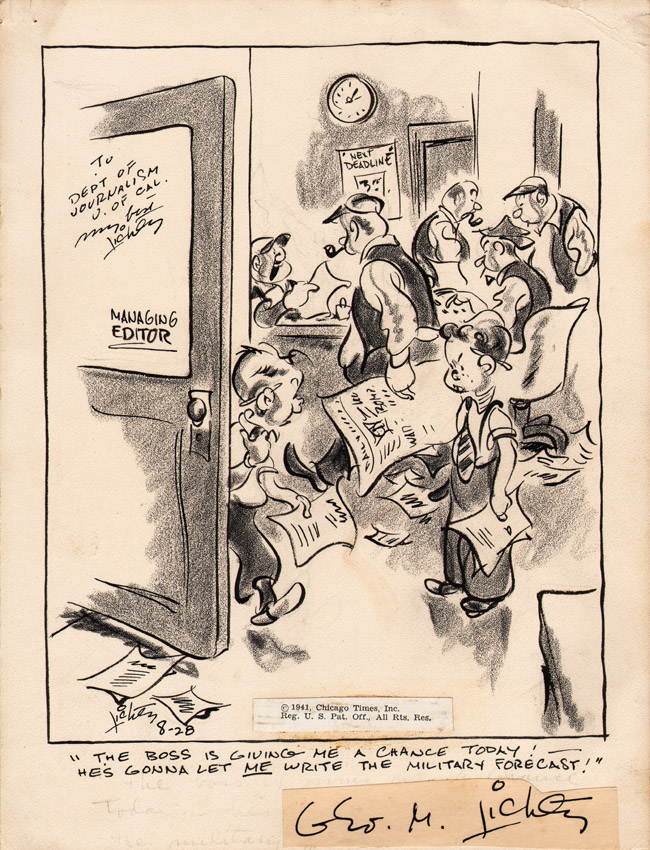
Enough yammering about the man, the myth, the legend. Let’s take a look at some Lichty wonderfulness. Early Grin and Bear It panels, like the 1934 example posted above, showcase strong cartooning abilities that display a lot of life. But they also seem a bit more derivative of other work at that time. Still, there are inklings in the drawing and figural attitude that are pure Lichty. As we move into the early 1940s, you can see a sea-change in Lichty’s work. The solidity of forms is still apparent, but this rambling, calligraphic line of Lichty’s adds movement and energy throughout the cartoon. In this early WWII example, from August 28, 1941, Lichty balances line and tone by treating both elements with a similar energy. The tone helps create the depth, weight and contrast, while the varied contour line brings the forms and energy.
I should clarify something here. Lichty worked on a slightly textured board, often referred to as Coquille or pebble board. It doesn’t have so much texture that it interrupts the flow of the brush line, but it does have enough texture to pick up tone. Lichty and many other cartoonists at this time were using a lithographic crayon to create the tone. The litho crayon has a bit of grease in it that allows the marks to stay put, as opposed to charcoal, which might smear. In lithography, the greasiness of the crayon allows water to flow off a litho stone, while allowing the ink to stick to the litho crayon marks and lines. When the stone is run through the press with paper on top of it, the ink comes off the stone and onto the paper. In the newspaper world, litho crayon would print as black and white, so it allowed cartoonists the ability to add tone, without painstakingly incorporating stippling, hatching or cross-hatching with ink. In Lichty’s case, those techniques would have taken away from his flowing brush line.
Moving to the “General Fuffle” panel from November 19, 1941, Lichty is making stronger use of the litho crayon in order to add both weight and texture to the piece. It also helps Lichty to better tie-in his camouflage gag, as the litho crayon helps camouflage the tones on the piece.
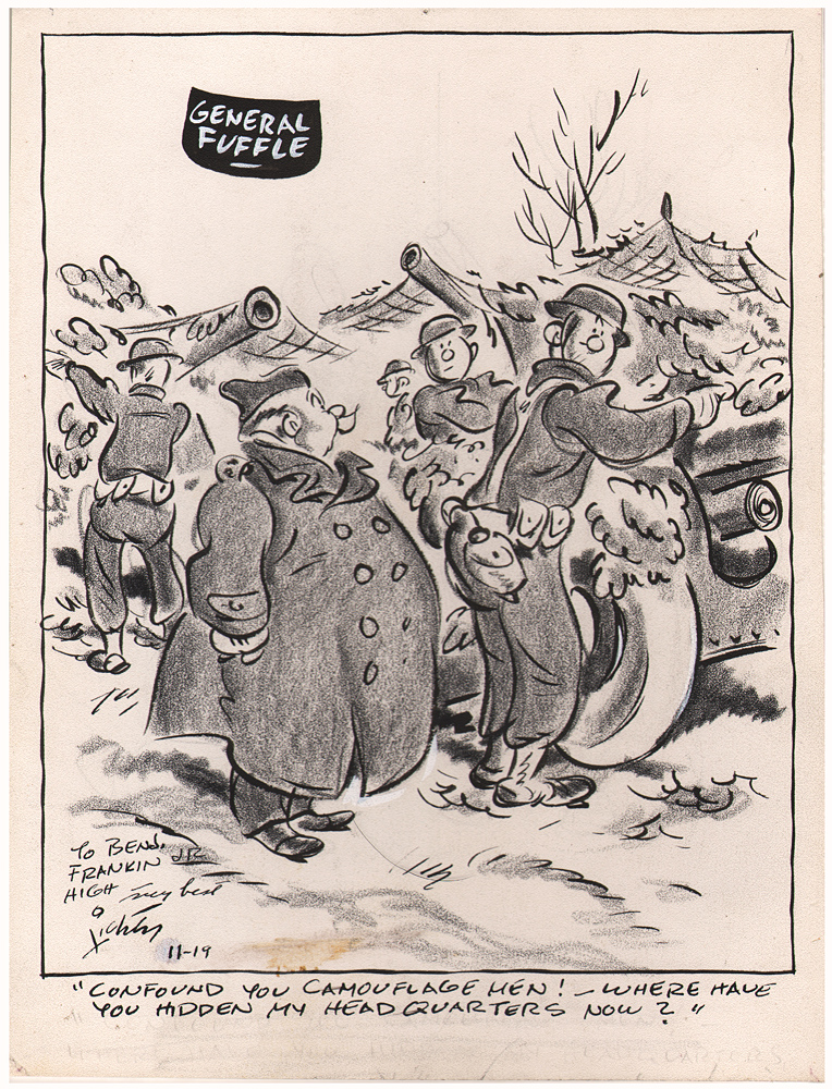
General Fuffle is the type of character that becomes standard in a Lichty panel. He is buffoonish and comedic in build and stance, and clearly out of his depth. The deceivingly simple look on the soldier’s face on the right tells us all we need to know about this general.
Besides Grin and Bear It, Lichty did a great deal of advertising cartoon art, from Burma Shave to Standard Oil ads. There are far too many to cover in one blog post, so there will be an eventual part two. And maybe more. But the cartoon below, published in the July 22, 1944 issue of the Saturday Evening Post, is a terrific example of Lichty’s Burma Shave ads.
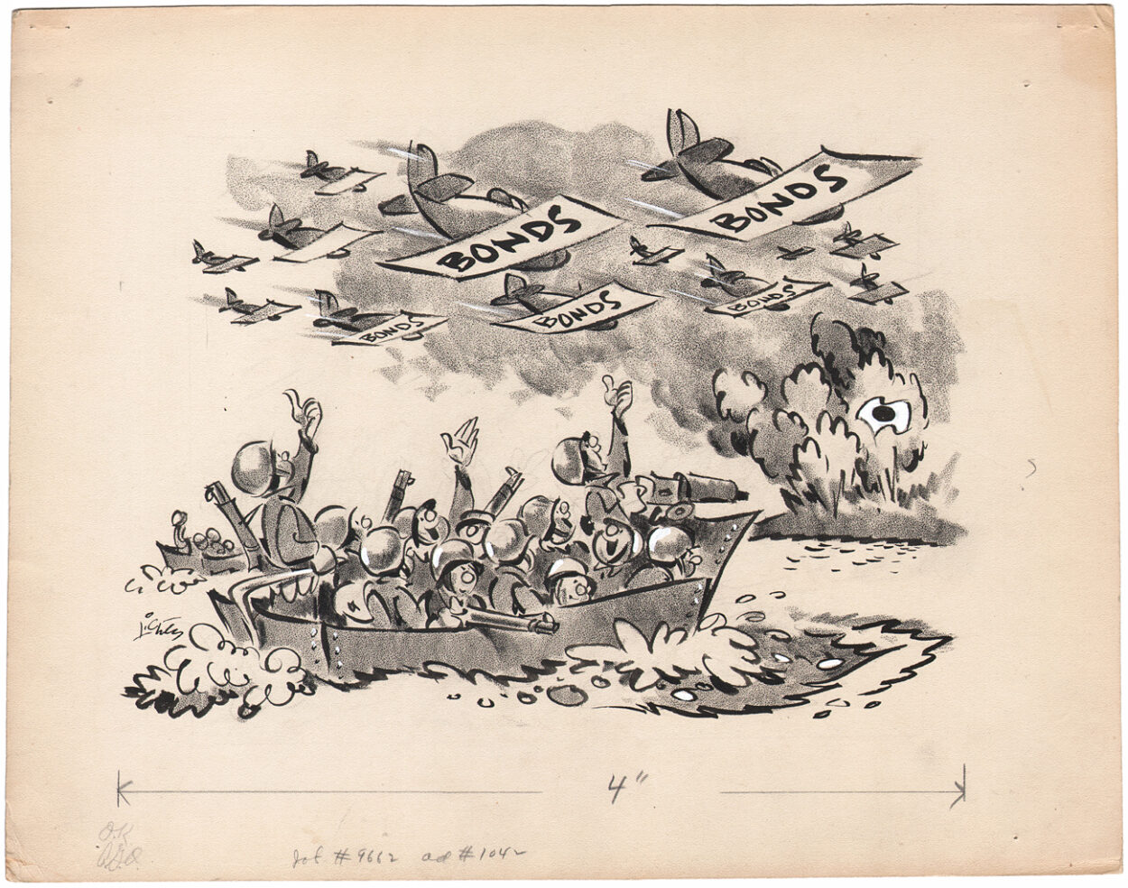
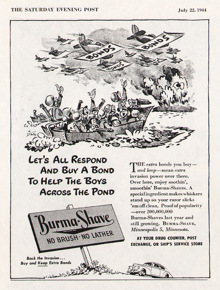
A number of Lichty’s Burma Shave pieces from this period referenced the war. Besides being an ad for Burma Shave, this cartoon is pushing the sale of war bonds, “To help our boys across the pond.” The first thing you notice about the cartoon is the absolute joyfulness of the drawing. A true joie de vivre with ink, brush and litho crayon. And this is the thing about Lichty: he did so much with so little. Look at the soldiers’ faces. Everyone has the official Lichty bulbous nose. Each soldier has a single dot for an eye and a slash or happy shape for a mouth. But it’s how everything comes together, with those active contour lines slashed about that pulls this piece together. You look at this cartoon and even forget the violence in it, as the planes with savings bond wings bomb a Japanese target.
There is one other thing to note about the piece above, which would become a staple in Lichty’s work. It is Lichty’s ability to use images that he makes us believe in, even though they could be easily confused if drawn by someone else. In this case, the waves caused by the boat are roughly the same texture and shape as the bomb blasts, but we know exactly which is which because of the context Lichty puts them in. And the energy of those shapes adds to the joyfulness that I mentioned above.
The last panel I’ll show from the 1940s is interesting, to say the least, especially when you consider the timing. The panel was published on December 27, 1945, a few months after the United States dropped atom bombs on Hiroshima (August 6) and Nagasaki (August 9).
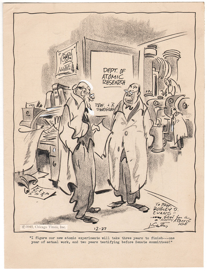
This cartoon shows two scientists who work for the Department of Atomic Research, discussing the timeline for completing their latest experiment. This includes two years of testifying before a Senate committee, so Lichty must have had a sense of the weight of the impact of those atomic bombs. The has changed a bit from the previous pieces I’ve shown. While the use of the litho crayon is roughly the same, the line work has become looser, with some of the brush lines whipping around when delineating their forms. The guy on the left who is doing the talking is the best example of the maturation of Lichty’s work. Check out his right arm and right leg. The contour lines are almost like organic zigzags. The make no sense at all in showing forms in a volumetric fashion, but with Lichty wielding the brush, they make perfect sense. Things like the desk to the left, or the guys working on the machinery in the other room, are like drawing whiplash, but everything there is needed. There are no extraneous lines or marks. And it is all joyfully executed.
One of the striking things about Lichty’s work is that nearly all of his scenes are static ones. I’m not referring to the quality of the drawing, but to the scenes themselves, which usually depict sitting or standing figures. There are no action lines to depict movement by the figures. It is the kinetic energy of the linework (and litho crayon tones) that brings the movement. This is reminiscent of the work of the Italian sculptor and painter, Alberto Giacometti. While Giacometti’s sculptures sometimes conveyed a moving figure, his paintings usually depicted either portraits or still-lives; subject matter that was still. Check out this painting, The Artist’s Mother, from 1950:
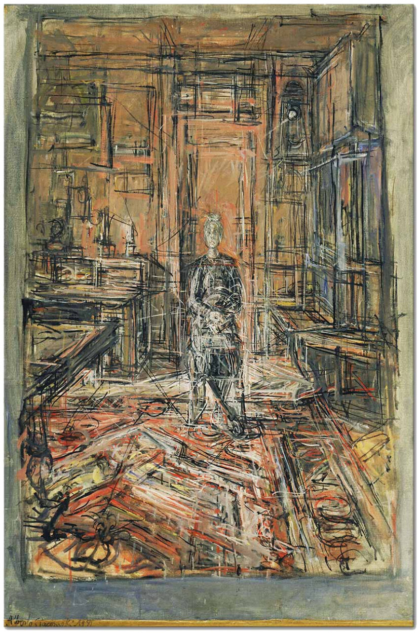
Compositionally, the painting is rather static, with Giacometti’s mother placed in the center of the picture plane, withone-point perspective leading to a vanishing point nearly in the center of the painting. But that’s where the static quality ends, as Giacometti weaves all of these hyperactively drawn marks together, creating a wildly active painting of a still subject matter.
In this example of Grin and Bear It, from March 2, 1955, Lichty takes a somewhat similar approach. Senator Snort, Lichty’s main character stand-in for governmental bluster and buffoonery, anchors the center-left portion of the composition, while his colleagues anchor the center-right. You’ll notice that the space between the two bellies is pretty much vertically dead-center. Like the Giacometti, it’s a static composition. But like the Giacometti portrait, this piece is anything but static.
You can see where Lichty loaded up his brush to begin those beautifully calligraphic lines. Even something like that chair behind Senator Snort, with the seat constructed of two brush lines, has movement. And check out those things that pass for feet in a Lichty drawing. They’re like a cross between baguettes and clown feet, and yet, as I’ve said before, they work. They somehow manage to hold up these bulky figures in a way that only Lichty could pull off.
I have a bunch of Lichty originals in my collection, but this pane from January 25, 1955, is one of my favorites:
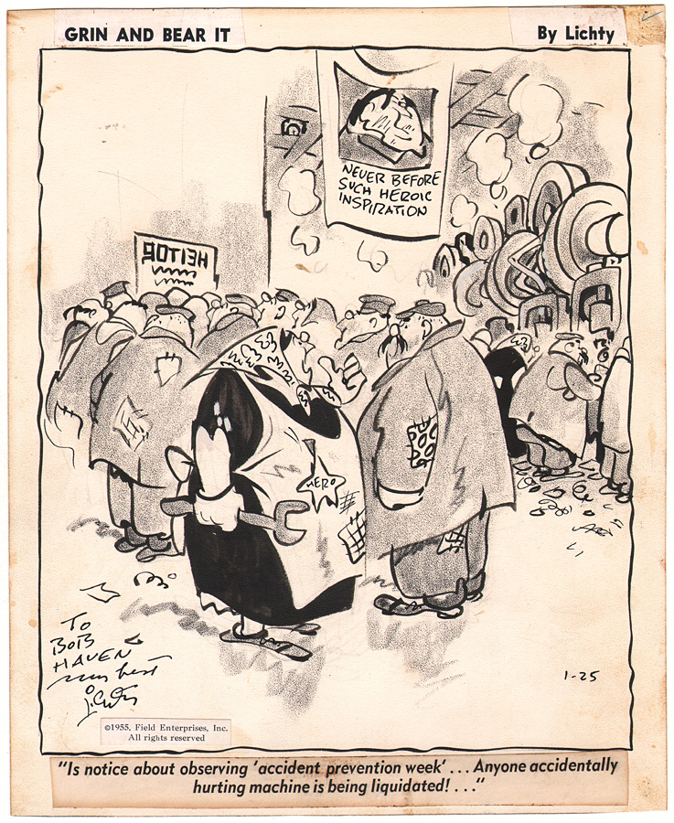
This is a perfect example of what Stephen Becker was referring to when he wrote, “…Soviet logic to a lunatic extreme…” Similar to the previous panel, Lichty has placed two figures smack in the middle of the composition, with the woman holding the wrench acting as the focal point in the cartoon. The use of her black dress adds both contrast and weight, while the rest of this slap-dash line work brings the movement. Slap-dash is often meant to convey something negative, as in something being done in a careless or haphazard way. But in Lichty’s hand, slap-dash brings the effervescence to the drawing. If lines were wild horses, Lichty hasn’t quite tamed them, but he’s controlled enough of the wildness that they bring the life to the drawing. There are 18 figures in this drawing. Yes, I counted them. 18 wonderfully funny, goofy figures, that bring the joyous reality in a Lichty cartoon.
I’ve written a lot about Lichty’s drawing so far, but little about the gags. Wonderfully drawn comic strips and panels can be a beautiful thing to behold, but if the gags fail, ultimately, so does the work. Lichty liked to employ a sometimes-biting humor in his work; humor that took advantage of the irony of a situation. In the above cartoon, done during the height of the Cold War, Lichty plays into some of the Communist tropes, where the worker is not always in the best interest of the party. The piece represents a wonderful combination of a pointed gag and terrific drawing.
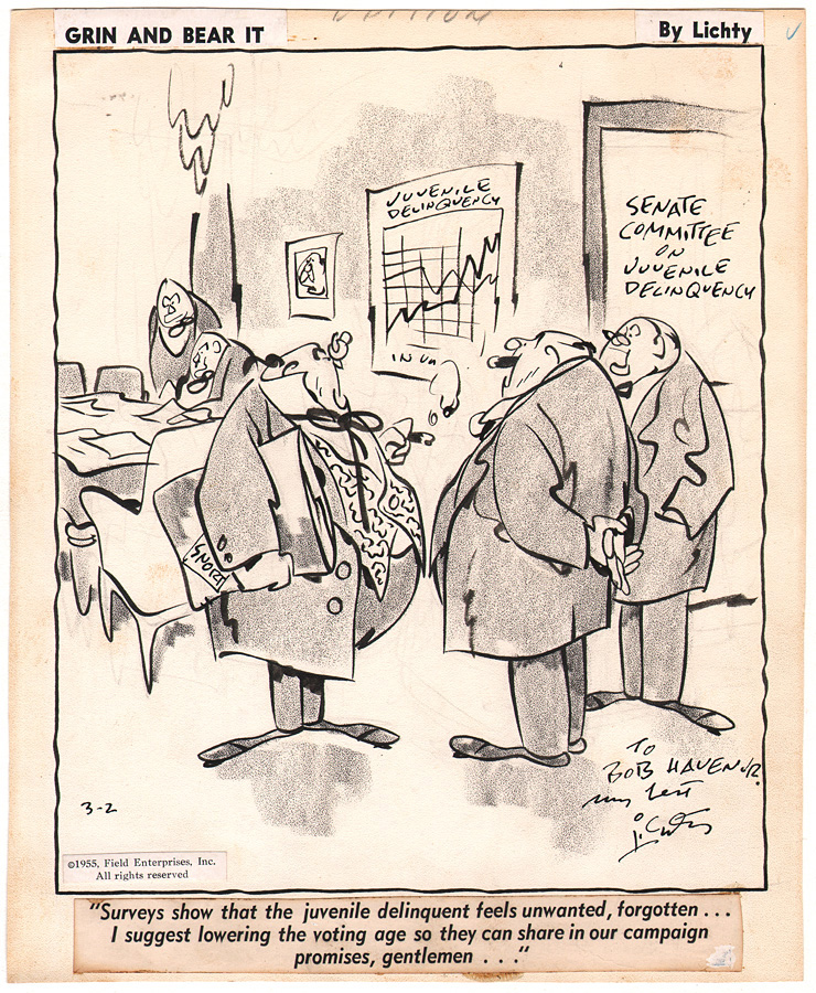
Speaking of Communism, the good Senator Snort is listening to a colleague trying to explain away a suspect meeting he attended four years ago in the cartoon below.
This cartoon features a bit different composition, as Lichty uses two-point perspective to lead the viewers’ eyes toward Senator Snort. You’ll notice that Lichty’s straight lines aren’t exactly straight, but they’re straight enough. When the rest of the lines are loopy and wiggly, straightish looks pretty damn straight! And just check out that beautiful contour line describing the chair in the lower right. It anchors that corner of the cartoon.
Like the New Yorker cartoonist, Helen Hokinson, Lichty enjoyed employing women’s groups as straight-women for his gags. In this panel, from October 28, 1960.
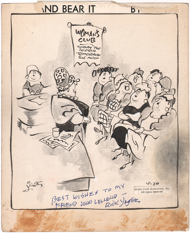
The caption for this piece reads, “…And for our annual ‘husband’s night’ I suggest our treasurer giver her annual report!…They ought to find that very entertaining!…” You’ll notice that the drawing is a bit sparer in this panel. Lichty makes use of the open space at the four corners to help frame the action in the center of the piece. This cartoon is also a nice demonstration of Lichty’s shorthand approach to drawing. He conveys so many elements with so relatively few means. One of my favorite aspects of this piece is how Lichty uses the coat on the woman at the far right to help frame that section of the drawing. As an aside, you’ll note that this piece was autographed to someone by Rick Yager, who worked on the Sunday pages from the 1960s until 1991. I imagine this was one of the pieces that Lichty gave to Yager, to help him learn how to emulate Lichty’s style. Interestingly, when I interviewed Rick in 1992, he considered himself a “hack” with pen and ink, but his approach to Lichty’s work was far, far from the work of a hack. He emulated Lichty’s approach beautifully.
Finally, let’s close with a subject matter that was near and dear to Lichty’s heart: hoboes. Lichty often used these characters as way to make social commentary on some relevant issue in the world. This Grin and Bear It panel is from November 23, 1962, just weeks removed from the Cuban Missile Crisis.
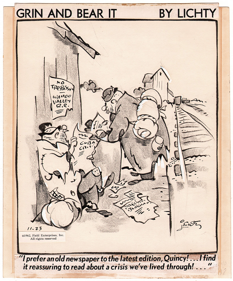
There is so much to love about this panel, from the beautifully wonky train tracks to the wonderfully delineated figures. Check out how Lichty plays with the line weight of the railroad ties as they go back in space to that also wonky rectangle that represents a boxcar. Getting back to the hoboes, Lichty always gave those figures a roundness, as if they’ve managed to lead a well-fed life. The body language is perfect, as the character sits on his bed roll, leaning back against the wall. This weird, misshapen hat sits beautifully atop his head, legs crossed; all done with a beautiful variation in thick and thin line work. And those feet! They look more like footprints than shoes, and not complete footprints at that. Yes, there is bigfoot cartooning, but in Lichty’s case, he’s both a Bigfoot cartoonist and an Abstract Foot cartoonist. In any event, they act as wonderful bases for these hoboes.
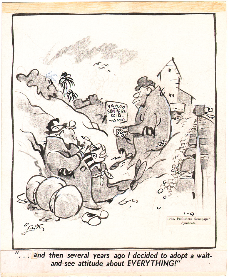
In our last Lichty panel, from January 9, 1965, we revisit our hobo pals, who are contemplating the philosophy of life. You’ll notice a very similar composition to the previous hobo panel, with the same train tracks and buildings, though the building at left has now been swapped for a hill. Again, Lichty has such a deceivingly easy way of handling the figure, showing a relaxed posture while managing to maintain weight and volume. There is a perfect balance between line and tone in this piece, as Lichty allows the varied weight of the lines to create form, weight and movement, while the litho crayon tone does the rest. Pure cartooning at its finest.
There have been many different American schools of cartooning over the past 130 or so years, but to this point, the Lichty School of Cartooning still has only one star pupil. And we are all the richer for it.
Many thanks for tuning in. I have lots more Lichty material in the collection, and we will revisit his work in the future.
Rob Stolzer
Rob Stolzer has been collecting original comic strip and cartoon artwork for over 40 years. He has written numerous articles for Hogan's Alley, the CFA-APA and other journals. Stolzer taught art at the University of Wisconsin-Stevens Point for 33 years, where he taught Art Seminar, Drawing, Figure Drawing, Graphic Narration, Illustration, and Painting courses.

5 Comments
Alex Johnson
Another excellent post, Rob.
Do you consider David Wright’s Carol Day the work of an ink-slinger?
Rob Stolzer
Thanks Alex.
I do consider Wright an ink-slinger, but that more realistic approach isn’t my cup of tea.
alxjhnsn
I was trying to figure out if “ink-slinger” had other connotations concerning genre or style. Thanks!
Rob Stolzer
Nope, it’s not genre specific. That’s one reason why I mentioned Flagg and Godwin, who are so different from guys like Lichty and Milt Gross. Ink-slinger is a mighty large umbrella.
Mark Morey
Thank you for this excellent article. As a child, I didn’t appreciate Lichty so much. I didn’t think about it so much, but I responded to what art historians would call “closed form” rendering. Willard Mullin was about as wacky as it got for me. Even MAD, as a comic book in those days, was “closed” in that way. It wasn’t until later that I saw Harvey Kurtzman’s actual style in JUNGLE BOOK. Later on, I began to appreciate the Abstract Expressionist freedom of Lichty’s drawings. What an amazing artist!