Pen Bites Man: The Inkslinging Virtuosity of Edward Sorel

Let’s take a moment to revel in the ink-slinging goodness that is Edward Sorel, whose wonderful memoir, Profusely Illustrated, was published by Knopf in 2021 during the height of the pandemic, so did not garner the attention it deserved. While this is not a review of Sorel’s book, I will refer to the memoir as a way of helping to highlight him as one of the best damn pen and ink illustrators of the past 60 years, deserving of both printed and digital ink praise.
In Profusely Illustrated, Sorel offers an unvarnished look at his life, from growing up the son of Jewish immigrants in the Bronx, to an artist who found his visual and intellectual voice. Sorel dearly loved his mother Rebecca, describing her in the beginning of the book as “…warm, upbeat, beautiful…” Sorel went on to describe the unconditional love she had for him, which allowed Sorel to confide in her. Sorel’s father, on the other hand, was the opposite. He describes his father Morris as “…stupid, insensitive, grouchy, mean-spirited, fault-finding, and a racist”. Sorel related his childhood fantasy of pushing his father off a train platform in front of an oncoming train. There is clearly a lot to unpack here, but one can imagine a connection when Sorel later wanted to change his last name from his father’s Schwartz, choosing the last name of the character Julien Sorel, from The Red and the Black by Stendhal, who “…was a sensitive young peasant who hated his father, was appalled by corruption in the clergy…and was catnip to every woman he encountered.”
In the mid-1930s, Sorel suffered a case of double-pneumonia and was bedridden for nearly a year. Though he was sick, Sorel could draw, and drew all sorts of images on the white cardboard that were placed in shirts from the laundry. Sorel would listen to radio programs, drawing cartoons and comic strips. That love of comic strips clearly continued into his later work, as you’ll see later in the post.

Sorel writes quite a bit about his schooling, at both the High School of Music and Art in Harlem, and Cooper Union. The love for drawing that Sorel developed early on in life was not only not encouraged in high school and college, but was quashed. This was during the time of the second generation of Abstract Expressionism and the schools were pushing a more abstract, shape-based approach to the arts. Sorel writes that by the time he left Cooper Union he no longer knew how to draw. He did, however, meet peers at Cooper Union who were later to become his partners at the Push Pin Studio: Seymour Chwast, Reynold Ruffins and Milton Glaser.
Once Sorel graduated from Cooper Union, he landed a job in the bullpen of an advertising agency, followed up by a job at Esquire magazine for nearly twice the money. At Esquire, Sorel became reacquainted with Chwast, and the two men made plans to create a promotional piece to help generate freelance illustration work. So began the creation of The Push Pin Almanack, a parody of a nineteenth century almanac. By the third issue of the Almanack, Ruffins, who had worked with Chwast and Glaser at Cooper, was brought on board.
Sorel writes about the pains it took to create the illustrations for The Push Pin Almanack. The shape-based approach to drawing that had been drummed into him as a student was making him miserable. It would be quite a few years before Sorel’s drawing process changed, helping to free him from those drawing constraints. Below is an example of Sorel’s illustrations from the Almanack.

Around this time, Sorel and Chwast set up The Push Pin Studio, with Sorel acting as the studio’s rep, meeting with art directors, trying to drum up work. Glaser, who had been in Italy, returned to New York and would soon join the studio, though Sorel was not initially enamored with the idea. The studio eventually hired a representative, Warren Miller, which allowed Sorel to devote himself fully to illustration. Things went quite well for the studio. They were making money and moving to a more expensive studio space, but Sorel was not content with the way things were going, and left Push Pin in the mid-1950s, striking out on his own.
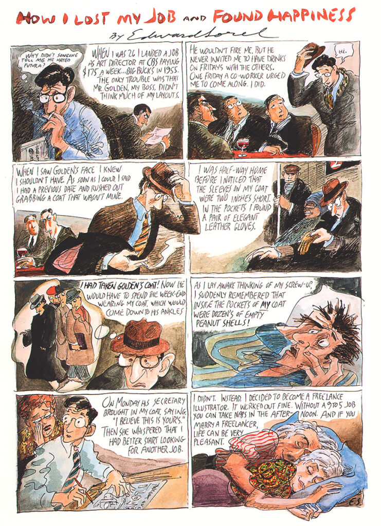
Sorel is a wonderful storyteller, as will come as no surprise to those who know his work, especially the more comic-strip style narrative pieces. He does a great job of intertwining personal and professional stories, as well as relating the politics of the period from his concise viewpoint. Sorel can be unsparing in his assessments, including assessments of himself. He can also be forgiving in those assessments. How I Lost My Job and Found Happiness is a wonderful ink and watercolor narrative, likely created for the memoir, that combines the tones described above:
Sorel’s struggles with an authentic approach to drawing bedeviled him for years. That changed in large part with a job he did for Esquire in 1966. The magazine was featuring Frank Sinatra on the cover, but Sinatra would not agree to be photographed the way the magazine intended. Sorel was approached to create an illustration featuring Sinatra for the cover, a plum of a job. But Sorel struggled with the piece, creating lifeless realistic portraits. After several failures, Sorel spent the night in the studio and created a wonderfully energetic drawing that conveyed the spontaneity that he had been looking for. As Sorel notes, “That Esquire cover changed my career. It gave me the courage to do more and more spontaneous drawings.” In hindsight, the Sinatra portrait does not have the same liveliness that we’ll come to see in Sorel’s later work, but it became an important jumping off point, allowing Sorel to embrace the process of drawing rather than the finished product.

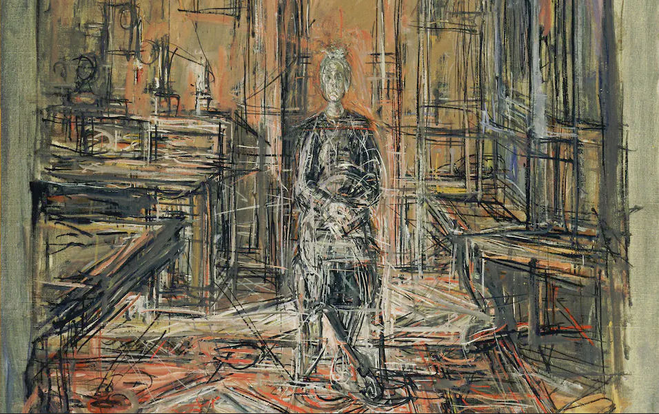
The activity in Sorel’s work is reminiscent of a number of artists, but two that spring to mind for me are Alberto Giacometti and Percy L. Crosby. Yes, some might consider this an odd coupling, but bear with me. Giacometti is most well-known for the expressive and often-elongated figures found in his sculptures, but his paintings and drawings reveal a process similar to Sorel’s, as each tried to discover the forms within the work via spontaneous mark-making. Giacometti’s drawings are lively, but the line is often one-dimensional. There is plenty of movement, but so many of his drawings were done in ballpoint pen or pencil, resulting in a line that is the same width throughout. Giacometti’s paintings tell a different story. They are more about drawing with paint than modeling forms with paint, and Giacometti varies those marks and strokes fully, finding the forms within the picture plane.
We find a similar relationship between Sorel’s work and Percy L. Crosby’s comic strip Skippy. In Jerry Robinson’s biography of Crosby, he described the cartoonist’s line as capturing lightning in a bottle. Crosby’s line was always moving, so much so that figures sometimes appeared to be constructed out of a single continuous line. The pen line revealed so much facility as it danced across the Strathmore paper, energetically creating forms and figures. That’s Edward Sorel right there, when hitting on all pen and ink cylinders.


Okay, enough chatter. Let me share some Edward Sorel ink-slinging wonderfulness from my collection:
The Babe Ruth portrait below appeared in the Washington Post Book World, likely in the 1960s. You can easily see the loose structure in the work, capturing the soft architecture of Ruth’s figure, as Sorel allowed the pen to find the form. There is so much wonderful movement, allowing the piece to capture the mass of Ruth’s form, all the while maintaining the energy of the line.


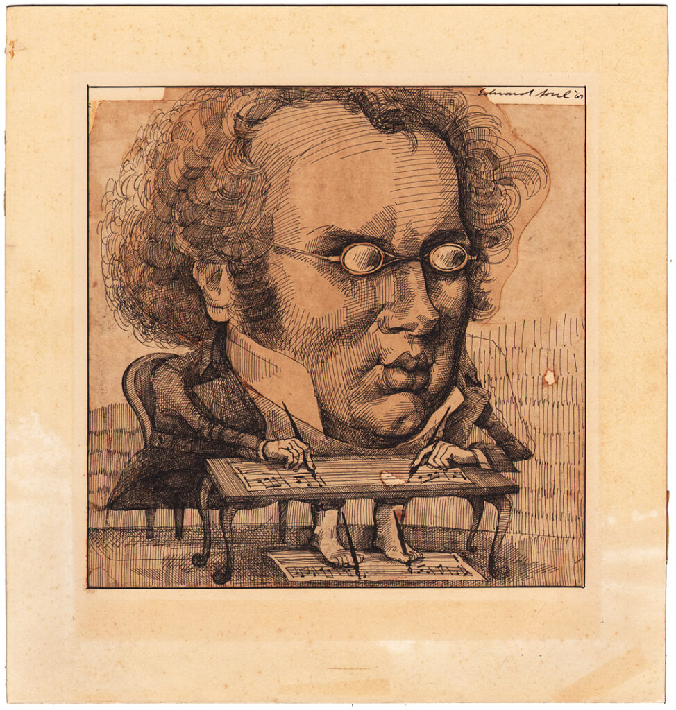
The caricature of the composer Franz Schubert below was drawn in 1967, though the place of publication eludes me. Schubert (1797-1828) died quite young, but was incredibly prolific, which is the point of the Sorel illustration, depicting Schubert composing with both his hands and feet. The pen work has a bit more of a formal structure, sort of a David Levine-vibe (or going back even earlier, a Linley Sambourne vibe), especially when compared with the Babe Ruth illustration. The textures and layering create a wonderful weight in the figure, with the pen work maintaining the energy in the line.
Sorel caricatured Dr. Joseph Ignace Guillotin, who is apparently taking his invention out for a spin in the illustration below. The drawing appeared in Word People, a book written by Sorel’s wife, Nancy Caldwell Sorel in 1970. It was later reprinted in a monograph of Sorel’s work, Superpen and also appears in the new memoir.
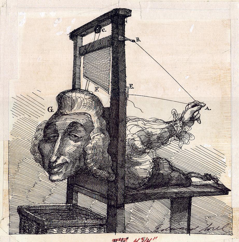
I’ve long been enamored with the richness and structure in this caricature. It combines some of the looseness found in the Babe Ruth piece, with the weight and texture in other early pieces. This illustration also gives some insights into Sorel’s working process, as you can see where things have been cut and pasted. Remember, these pieces weren’t drawn for gallery presentation, but for publication, so a rough-looking original is all a part of the process. Finally, I dig the Rube Goldberg contraption reference, though I don’t recall the ramifications of any of Goldberg’s cartoons as being so dire. Gentle readers of this blog do not want to know what H would be.
In 1970, Sorel created the three ink illustrations below for the Spring 1971 issue of Horizon magazine. The illustrations accompanied an article titled, “How to Choose a Royal Bride”, written by Frederic V. Grunfield. The article is subtitled, “From Henry VII to Prince Charles: here are twenty-four male chauvinist questions to ask of any prospect.” The pen work in these illustrations is just mind-bogglingly good in person, though I’m most partial to the first two. I’ll add a comment or two beneath each piece.
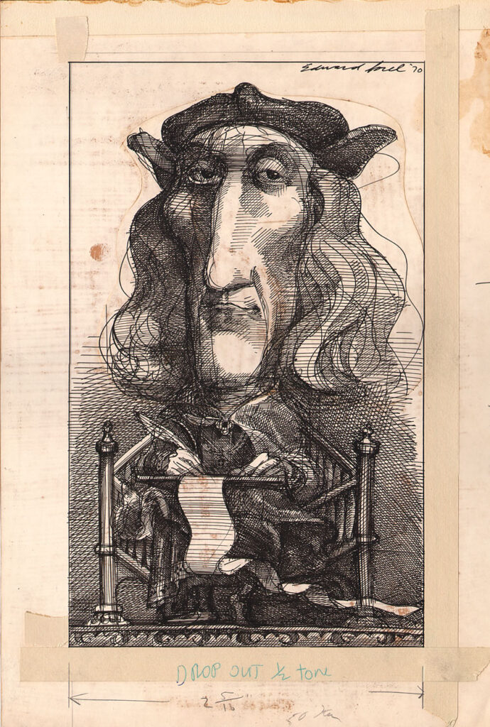
I mentioned a Levine-vibe in an earlier piece, and you can see that in this one as well, especially around the eyes, but the structure in the piece is just wonderful, especially where the weight is built up layer-by-layer.
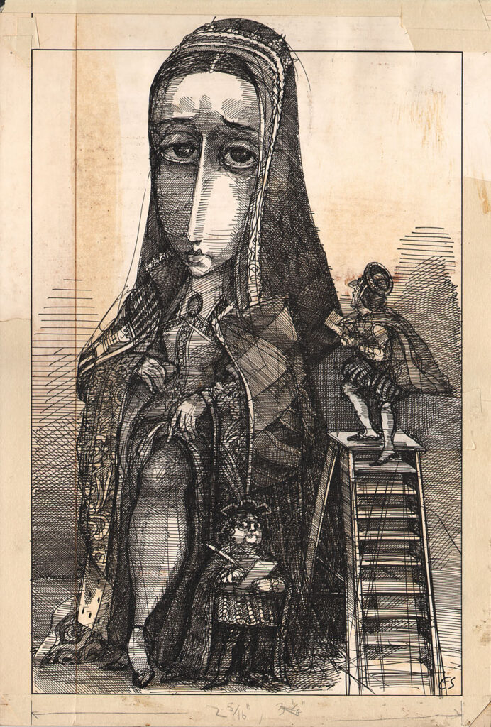
The second of three illustrations for the article depicts the royal bride candidate showing a little leg, as she is being measured up by members of the royal entourage. This is my favorite of the three illustrations, with such a beautiful use of space combined with a richness of layering and textures. When I’m teaching first-year college art students about pen and ink drawing, I refer to the tones in a piece like this as optical gray tones. They are not true gray tones, but a series of black and white lines constructed in such a way that they appear to create gray tones. Sorel is a master at this, creating so much richness throughout in his pieces. Check out the detail of the piece below:

The final illustration in this trip depicts a young Prince Charles, with Cupids fluttering about, showing Charles royal bride candidates.

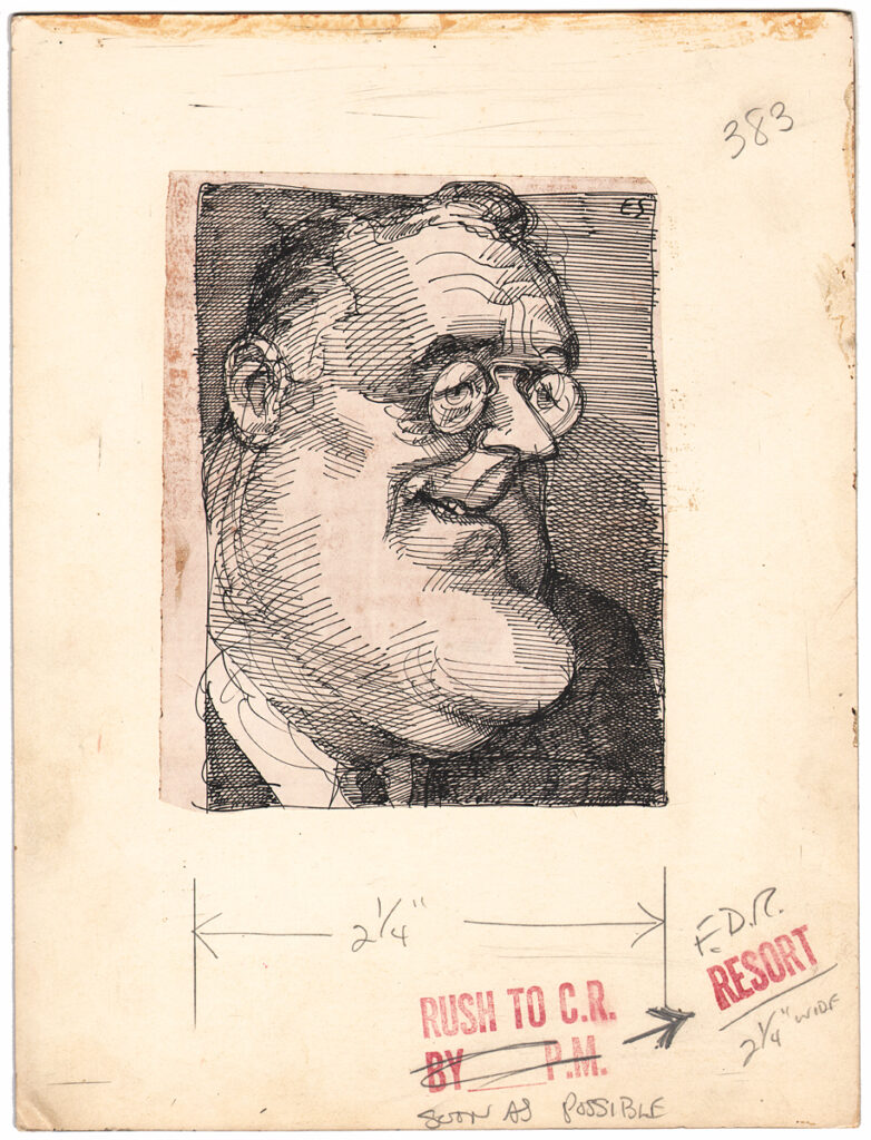
Before leaving this period of Sorel’s work, let me share one more piece. This caricature of Franklin Delano Roosevelt likely appeared in the Washington Post Book World, circa the 1970s. I have not been able to track down an actual publication date yet, but man, check out that pen work! There’s structure, there’s looseness, there’s scribbling, there’s energy! And yet again, that sense of tone and mass helps to set off the line work beautifully.
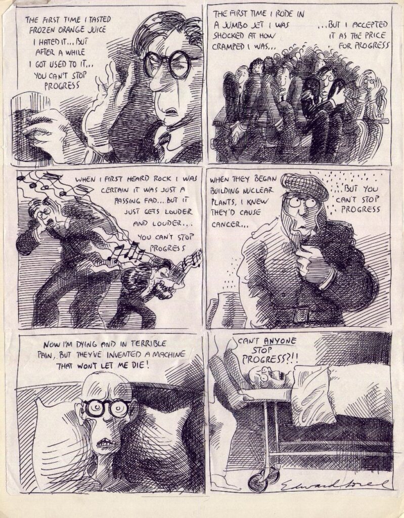
The next piece is the first of three comic strip-style illustrations that I’ll share. This one likely appeared in the Village Voice, and given the guy with the boombox in the third panel, I believe it’s from the 1980s. You’ll note the activity in the pen work that we know and love about Sorel’s work, but one thing different about this piece is that it was not drawn with a dip pen in India ink. This one was drawn with a thin marker. Works done in marker can come off as flat, given the sameness of the line quality, but Sorel layers his marks, making sure that there’s a lot of activity in the mark-making. It’s also a beautifully designed page, with a clever use of white space, especially in the first and third panels. And yes, the theme of the strip can be applicable to most any time period.
The juicily drawn cartoon below appeared in the June 1985 issue of Penthouse magazine. This is one of those pieces that appears to be drawn almost effortlessly. The figures have a breeziness about them, both in terms of the contour lines and the shading. The scribbled hatching on the right side of the man in the first panel help to anchor that panel beautifully, balancing structure and spontaneity. As in the piece above, the white space is used well, allowing the text to weigh down our heroine. And the writing is simply top-notch.

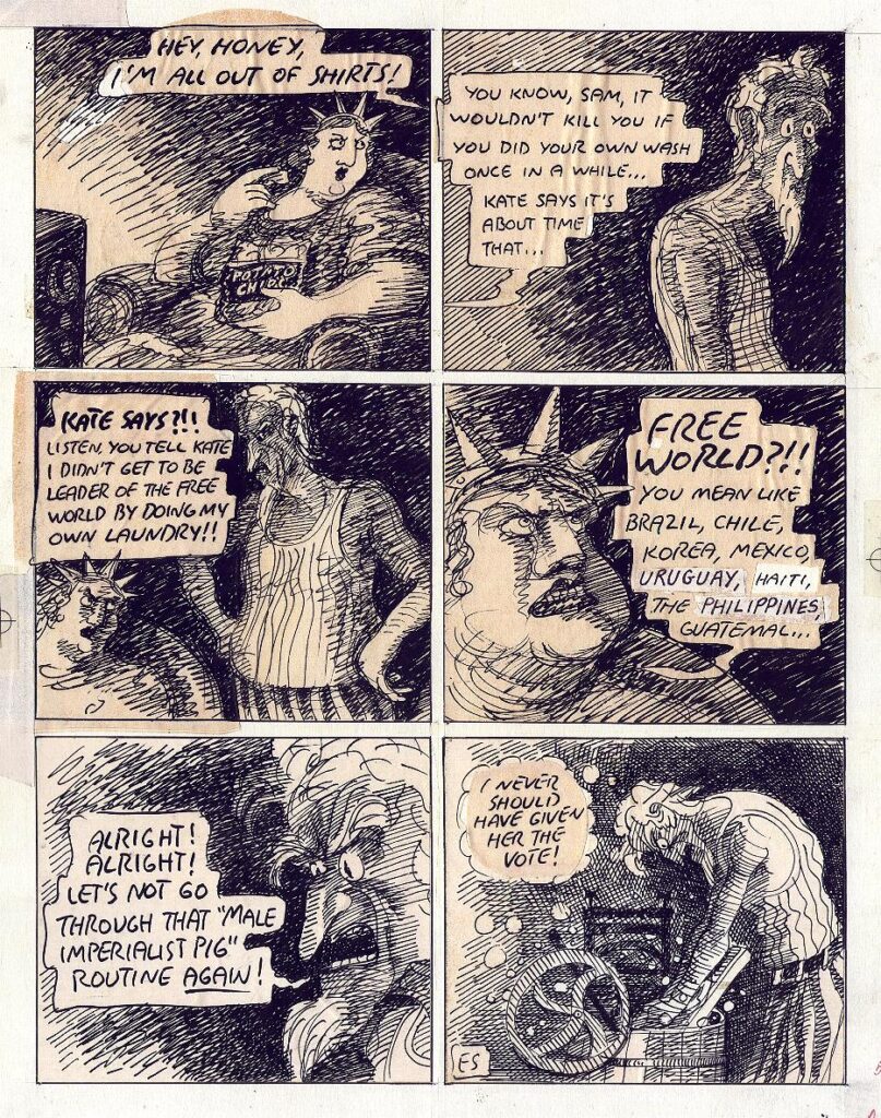
Finally, my favorite Sorel original from my collection. The cartoon below appeared in the May 16, 1977 issue of the Village Voice, and is titled “Male Imperialist Pig”. This is Sorel at his biting best, slinging satirical ink in a way that conveys movement, body language, space, weight and more. You’ll note the use of word balloons in this cartoon, which makes sense as Sorel was not dealing with white space, and needed the balloons to create contrast against the space. The word balloons also appear to make the argument more physical, as the words literally hang in the air. And we all know that Uncle Sam does not stand a chance. Nor should he.
I will leave you with a couple of final images from Sorel’s book Profusely Illustrated. The first one is one of Sorel’s classic takes on Richard Nixon, which appeared in Rolling Stone magazine. The second one is a piece that encapsulates Sorel’s art, writing and humor well. I cannot recommend this book highly enough, especially if you’re a fan of left-wing ink-slingers such as Edward Sorel. It is available from fine independent booksellers, as well as those conglomerate types.
Many thanks for checking in. I hope to see you down the ink-slinging road in the future.


